Seamless Migration: Data Importing Made Easy

Careful, your seams are showing
My first major initiative leading the Desktop Migration team was to improve the end-to-end experience for QuickBooks Desktop users who chose to switch to QuickBooks Online. How could we help them migrate their data easily and seamlessly?
The Process: Data + analytics
The original roadmap was focused on the tail end of the experience, teaching users how to use QuickBooks Online after they had already migrated their data.
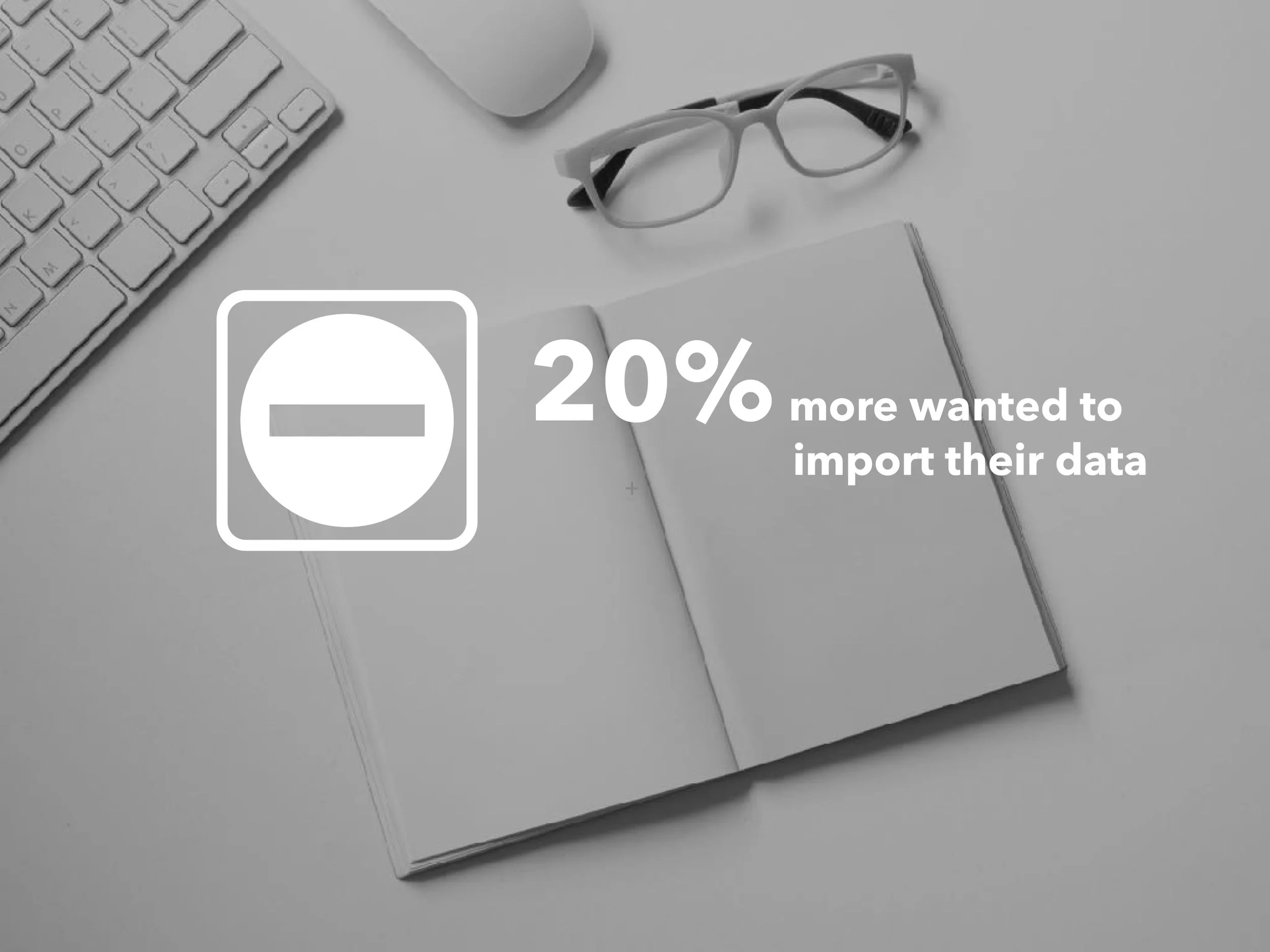
However, from looking at customer care calls and analytics, in addition to "follow me home" visits, we knew a substantial portion of problems were happening with users further upstream, before they ever landed in our product.

Role
Design leader
Principal Service Designer
Deliverables
Design strategy
Use case blueprints
Primary flows
Team Deliverables
Prototype
Final wireframes/schematics
Final visual mockups/redlines
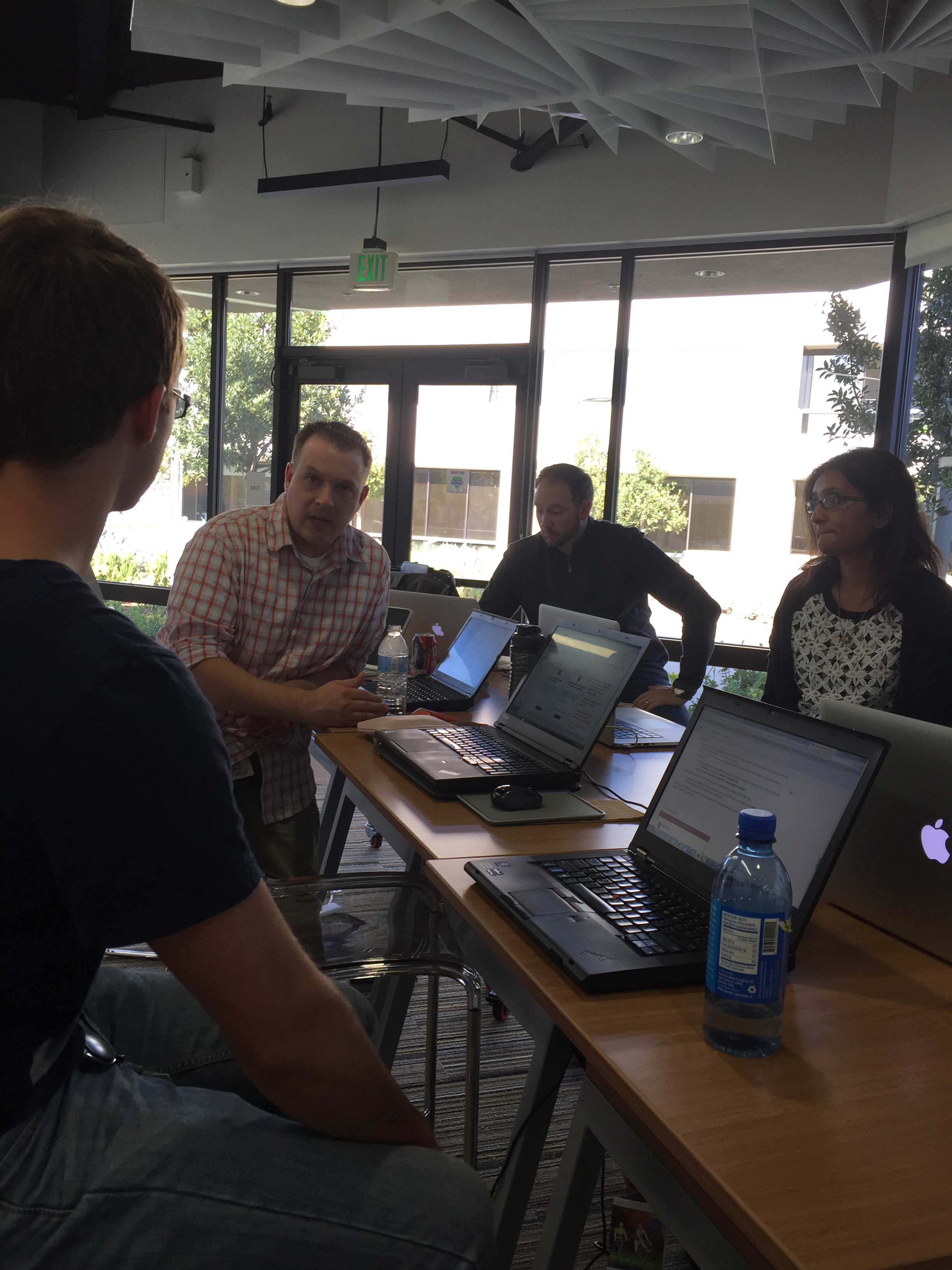
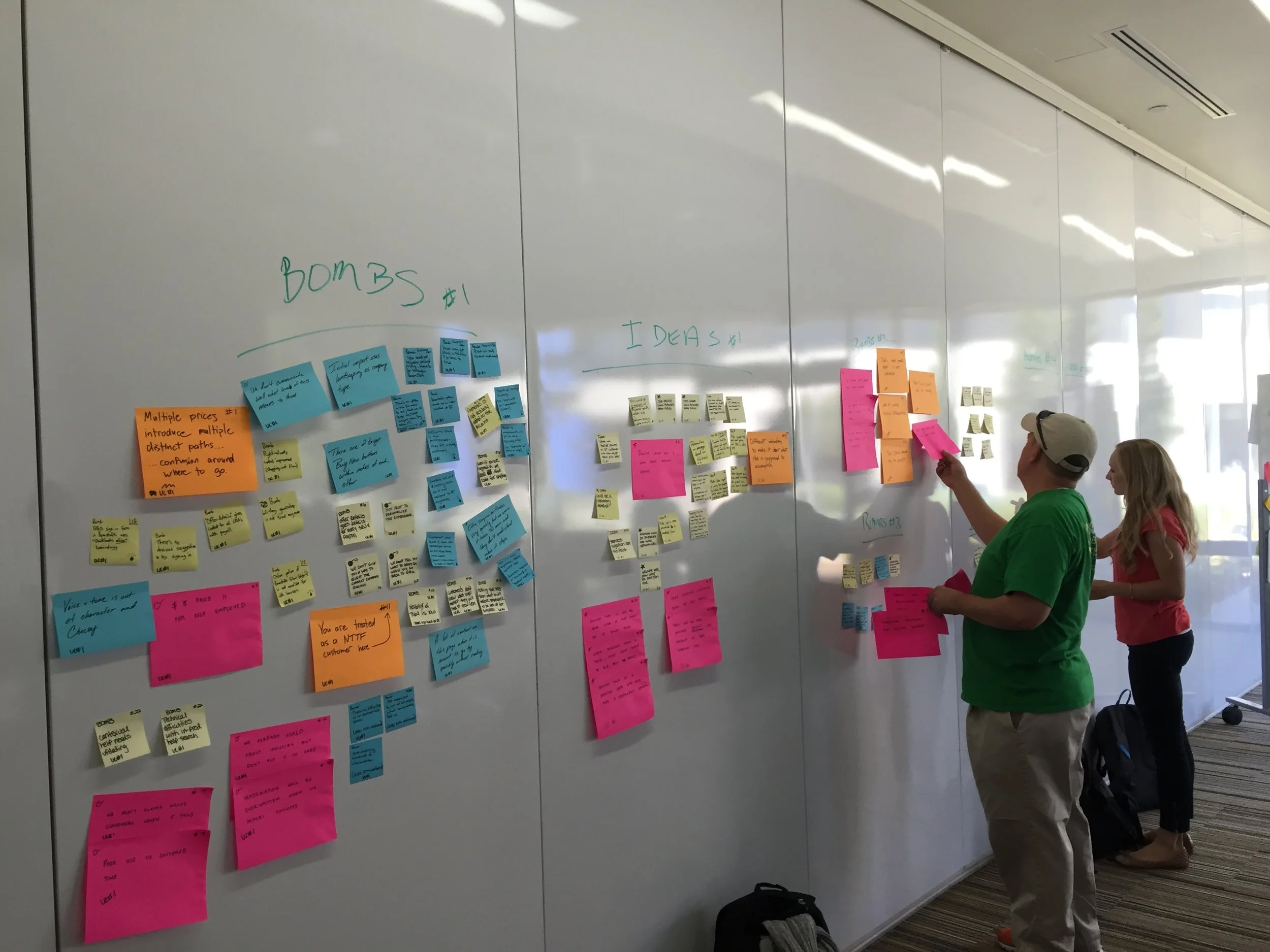
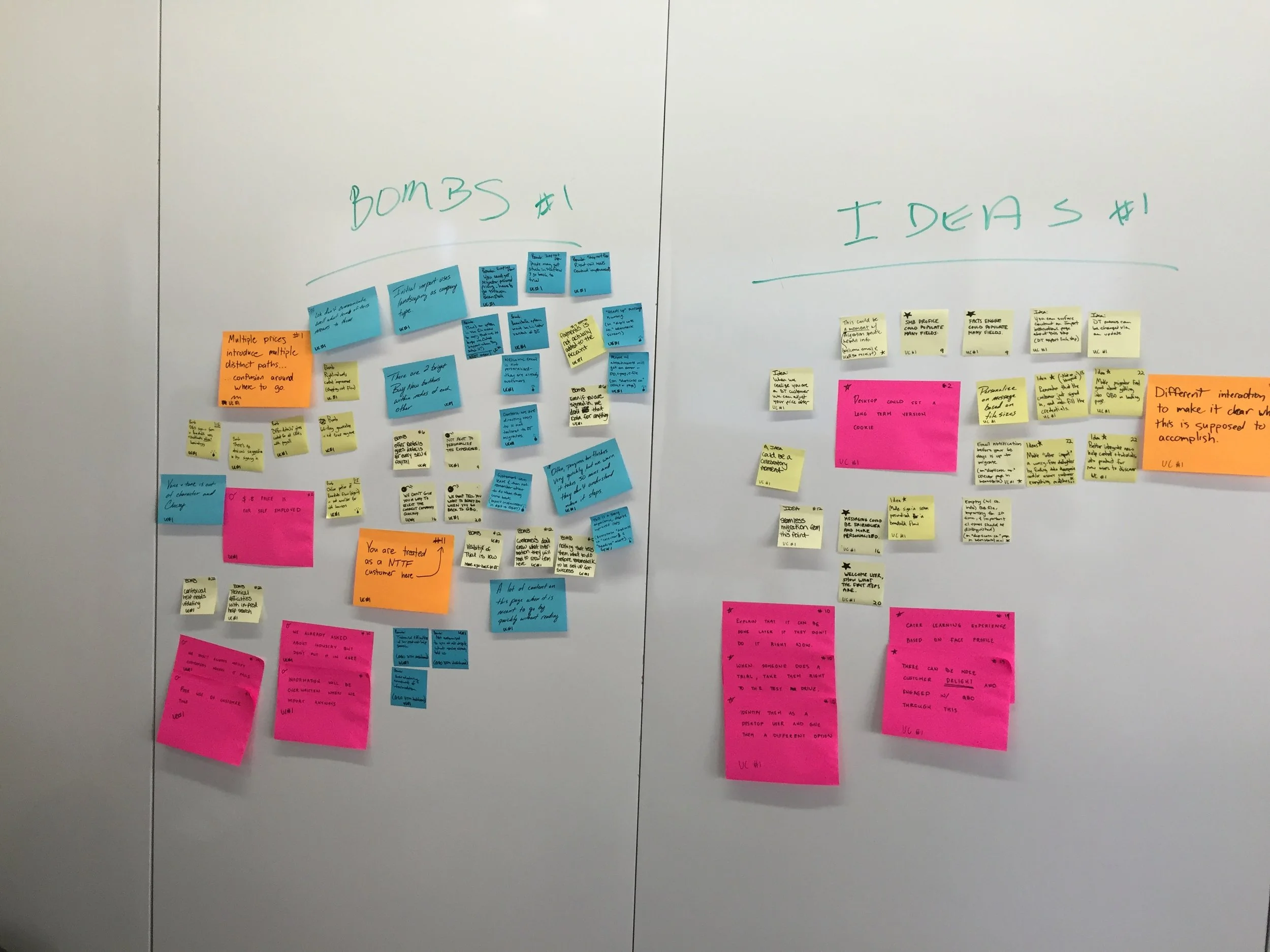
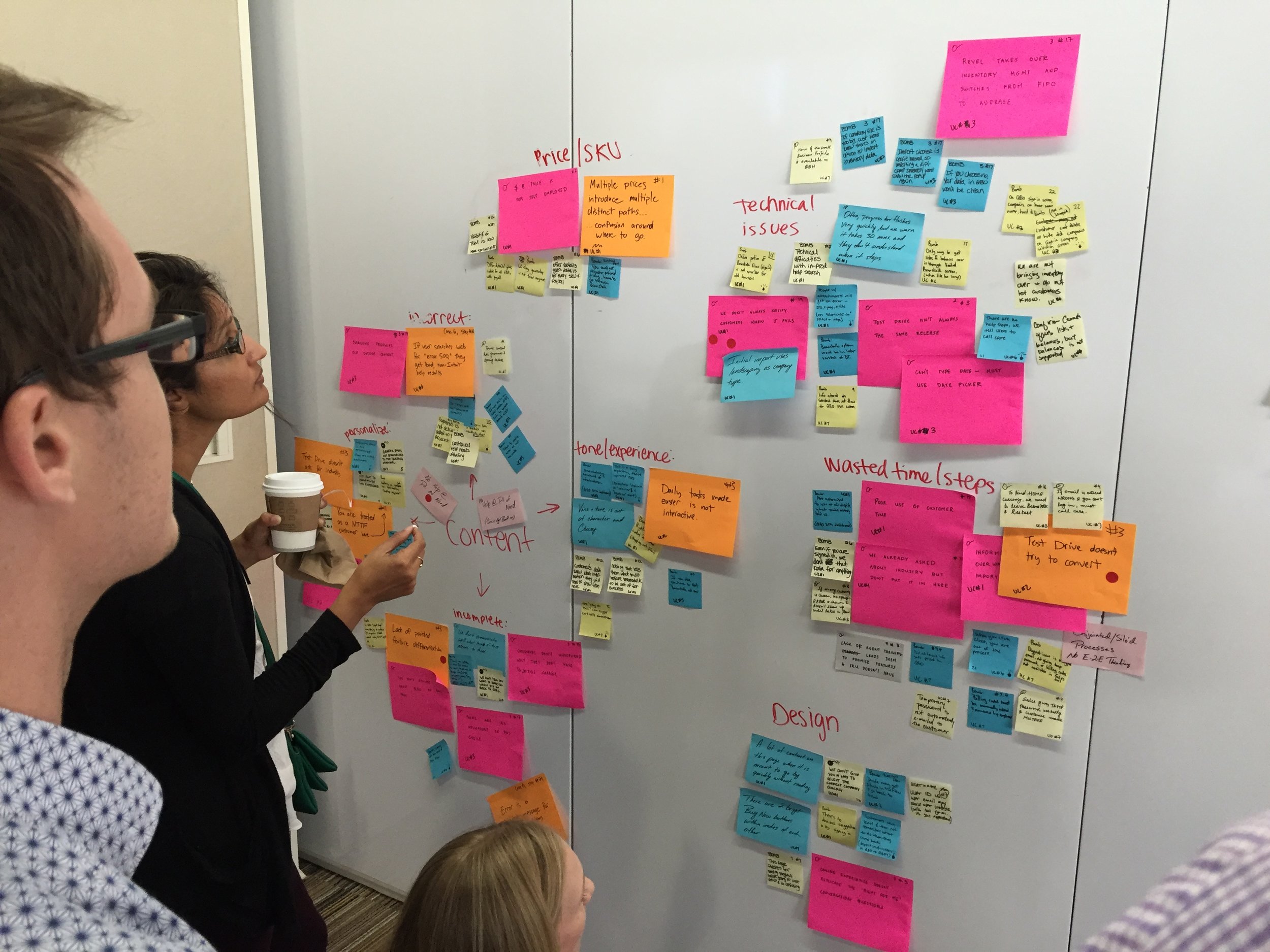
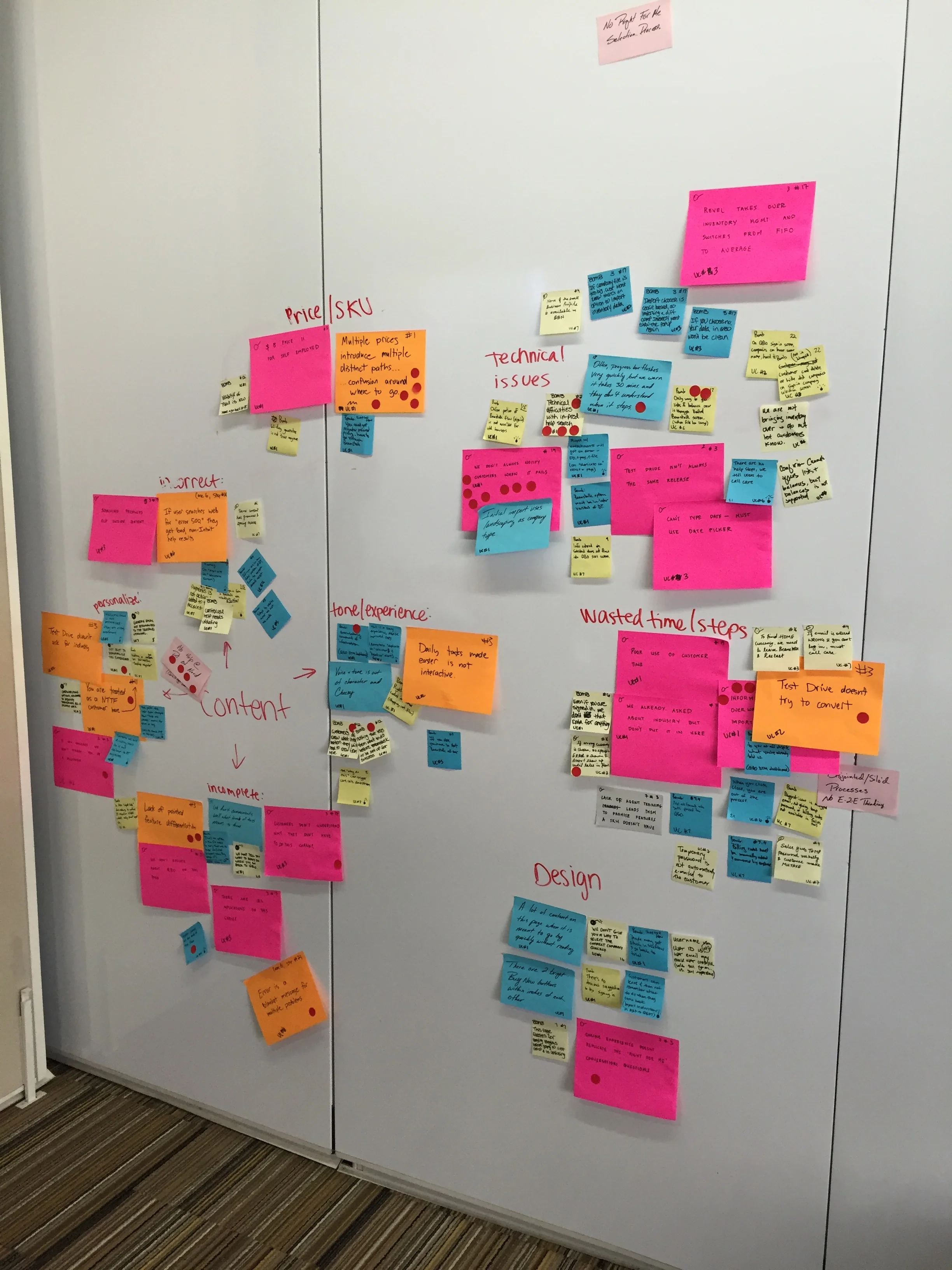
THE PROCESS: Blueprinting workshop
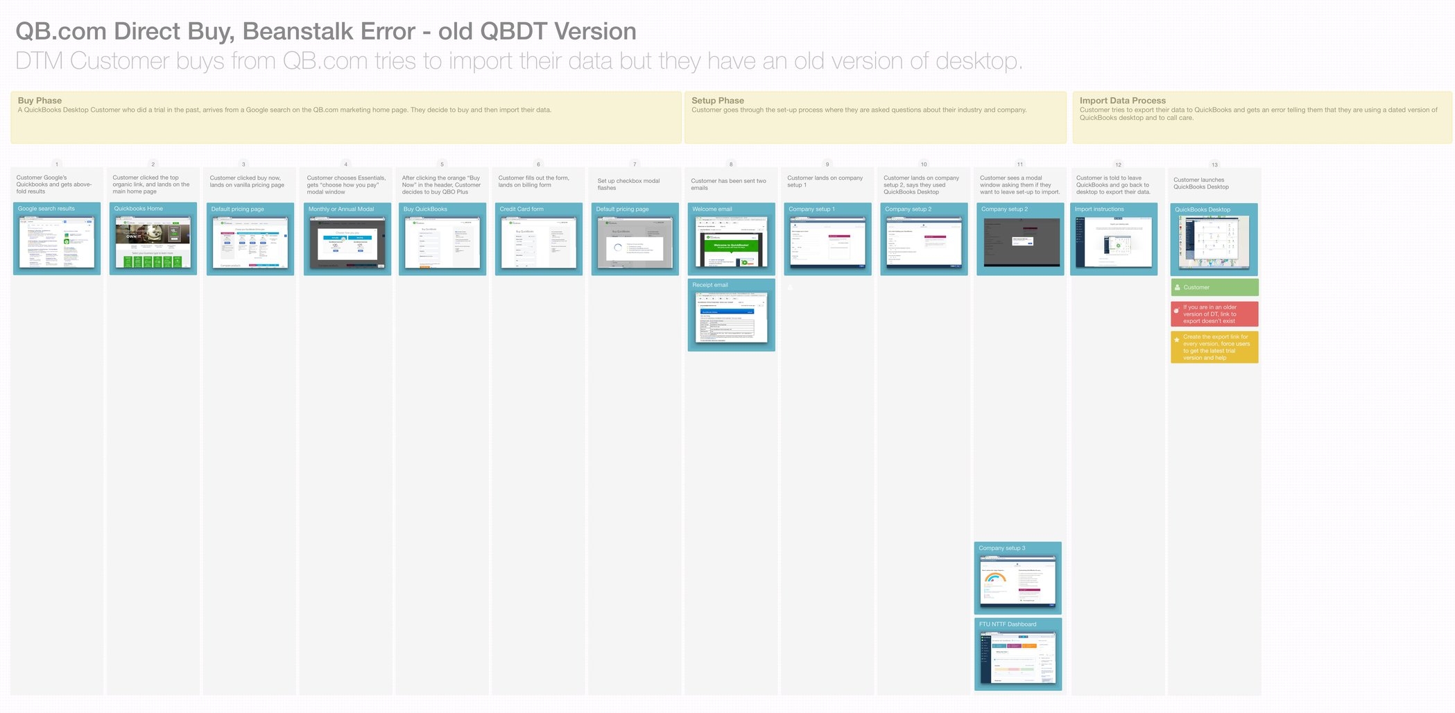
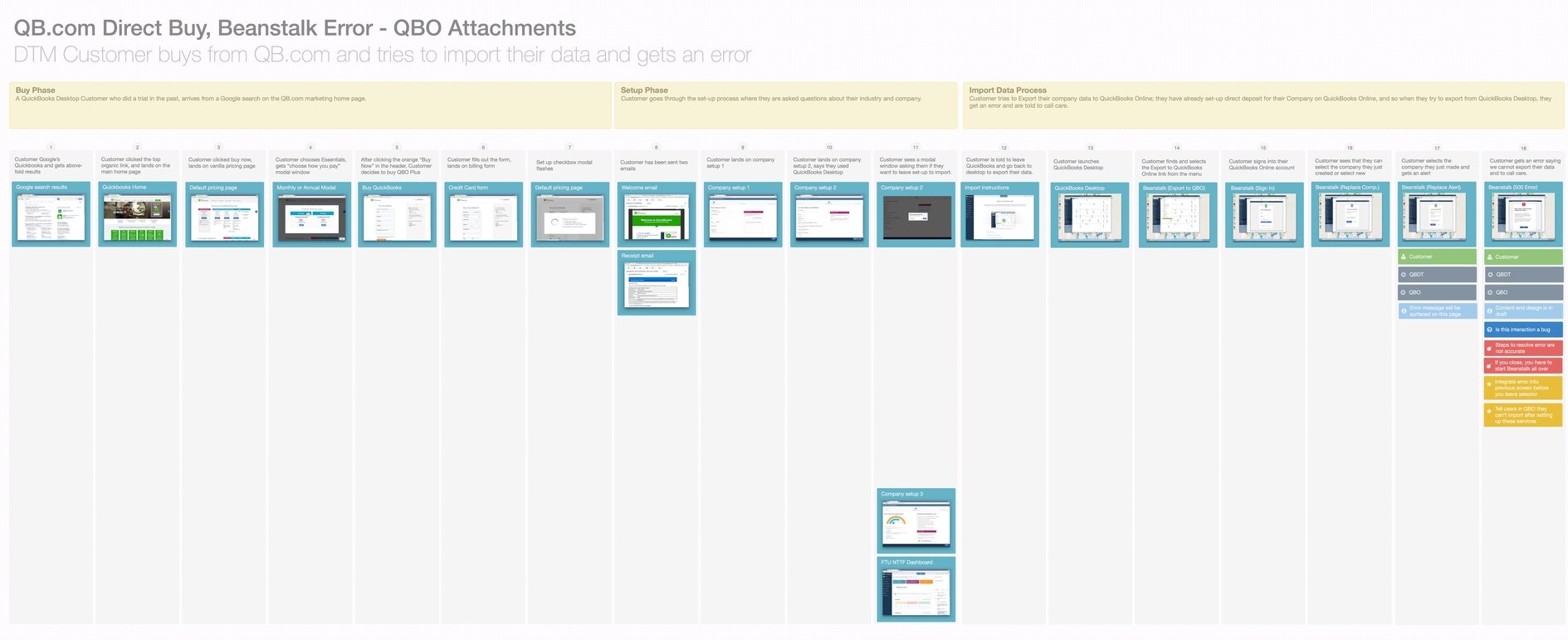
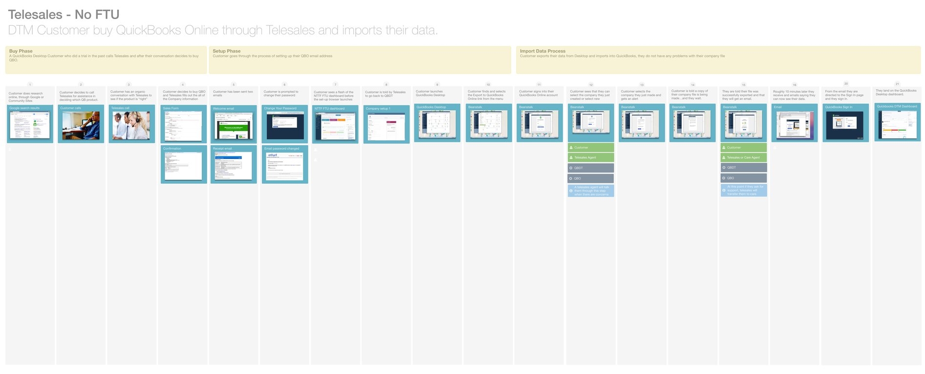
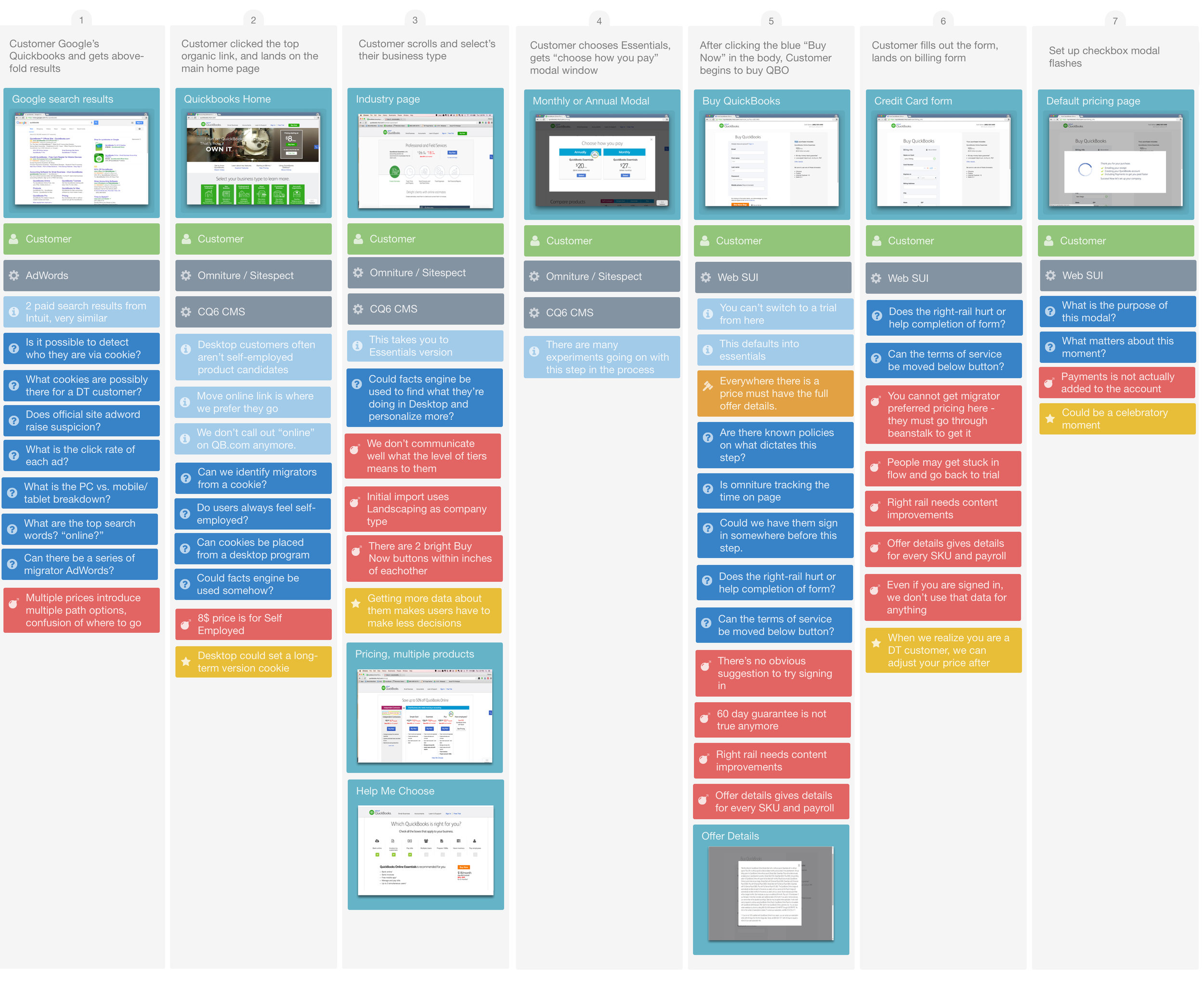
My product manager and I pulled together a cross-functional group of engineers, designers, customer care agents, and marketing partners to create blueprints (view full set .pdf) of the primary use cases for Desktop Migrators, starting with the 22-step happy path.
(Click photo to view larger)

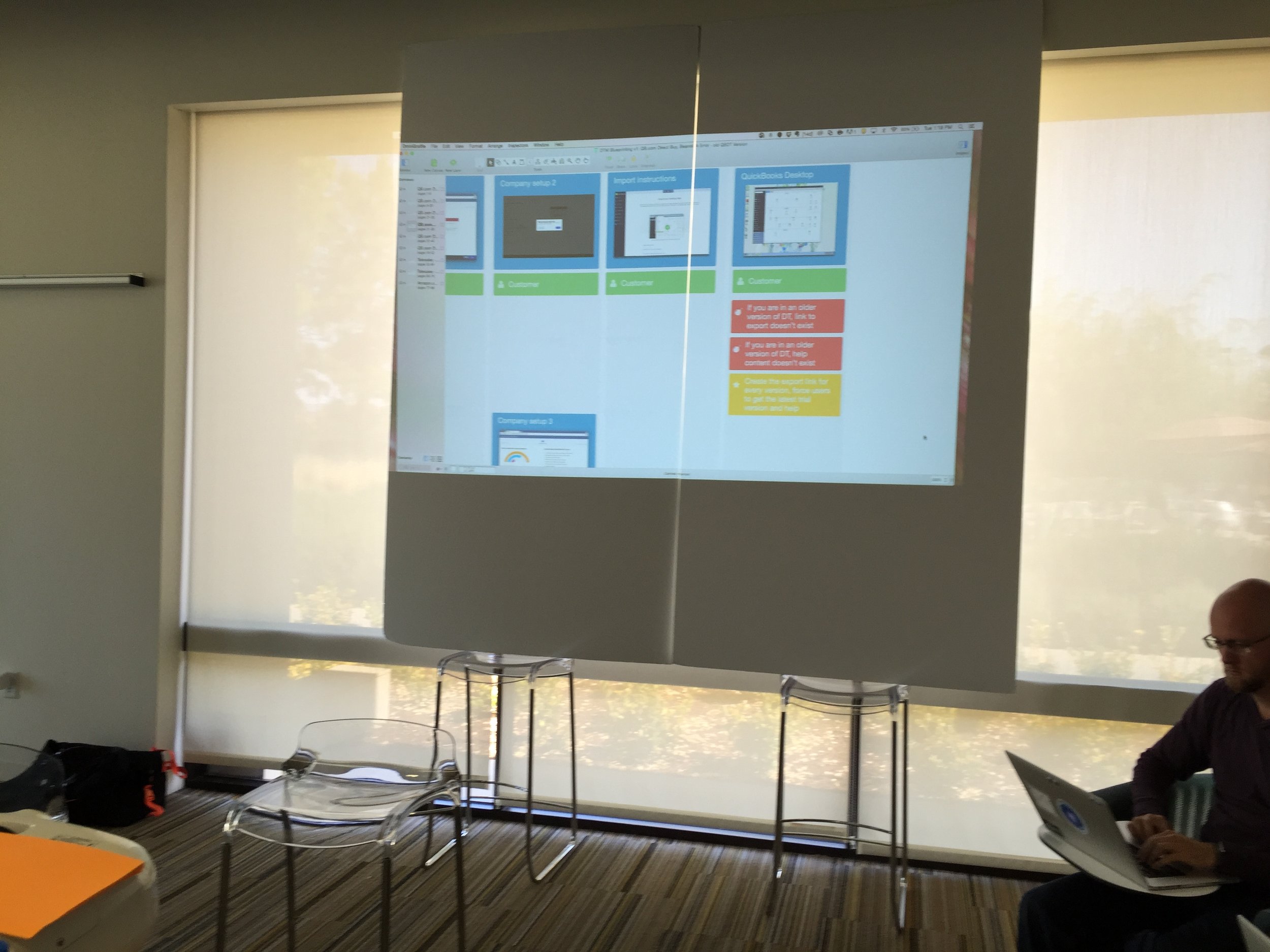
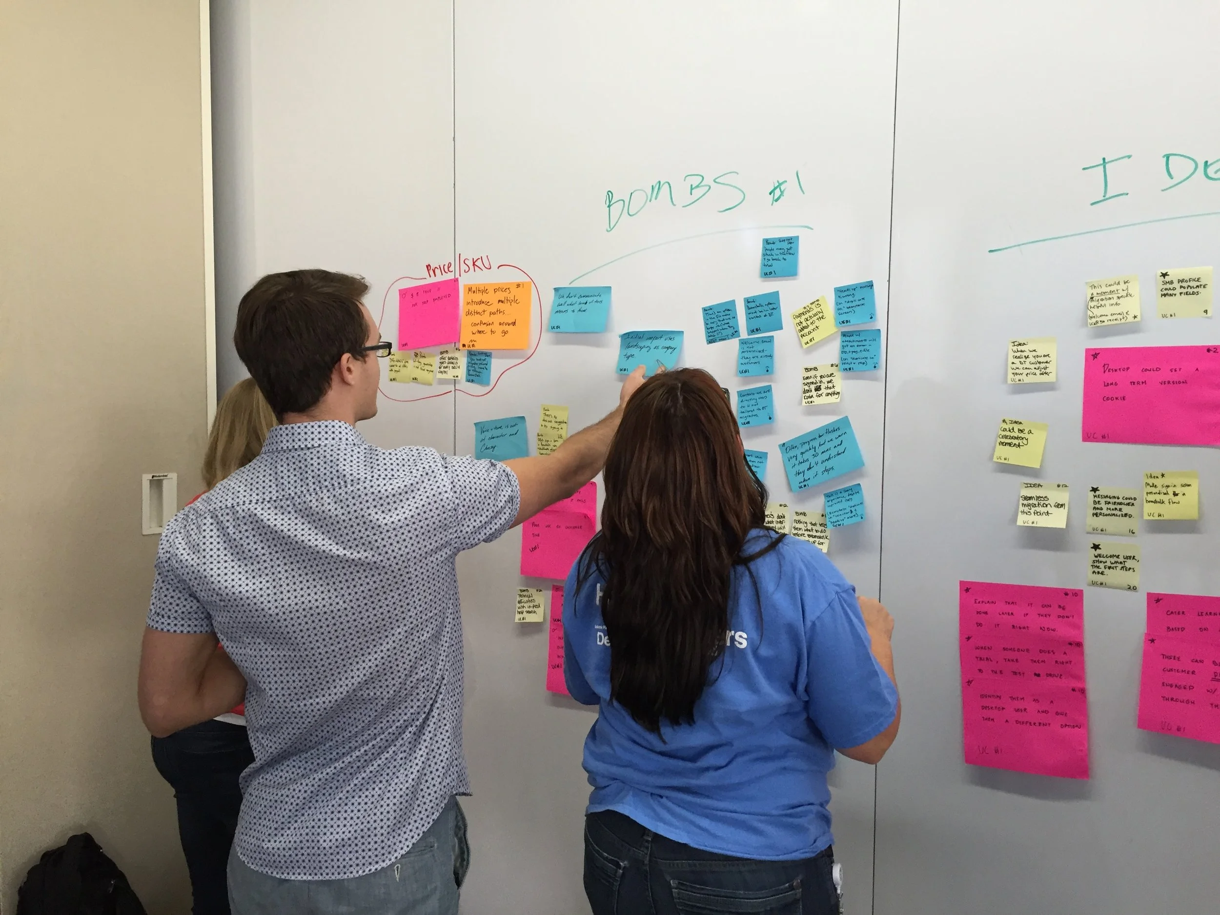
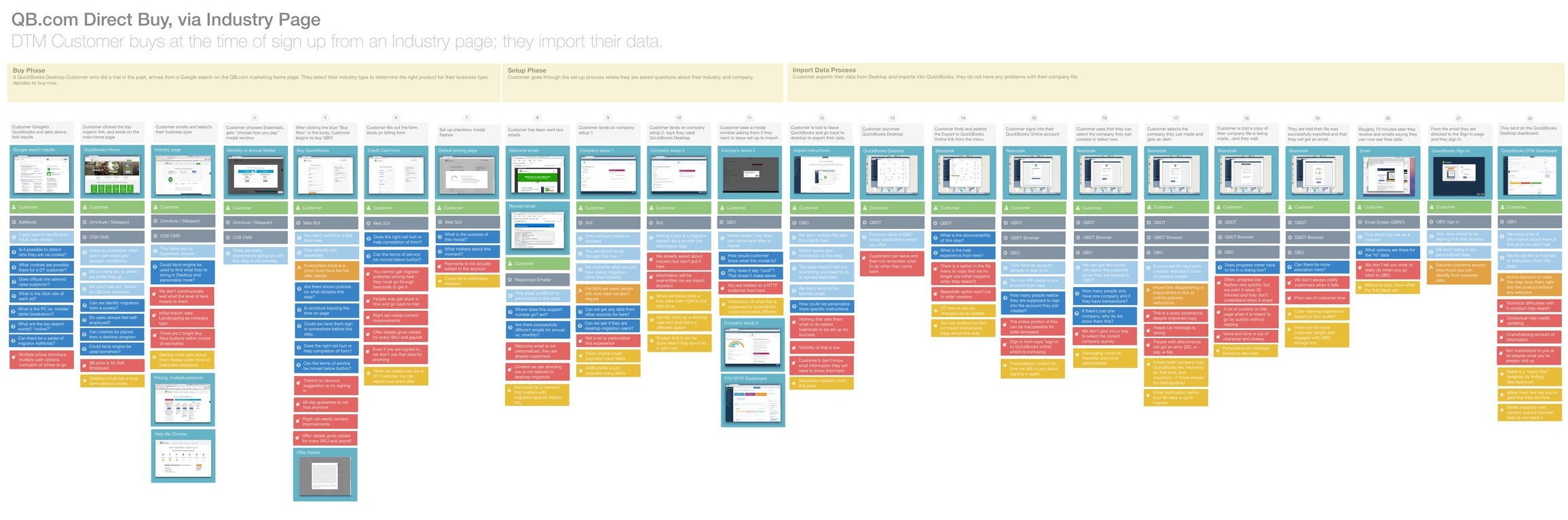
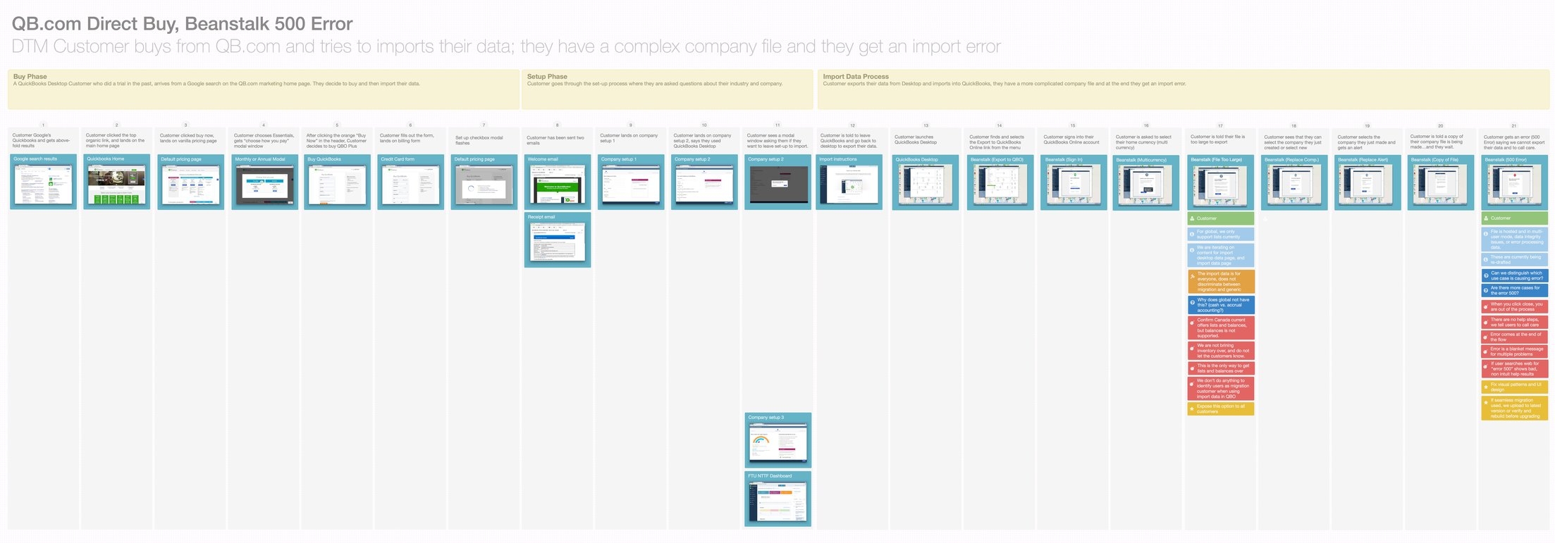
(Zoomed in detail on the “buy” steps)
The DESIGN STRATEGY
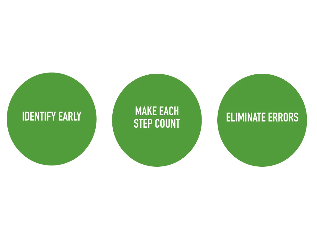
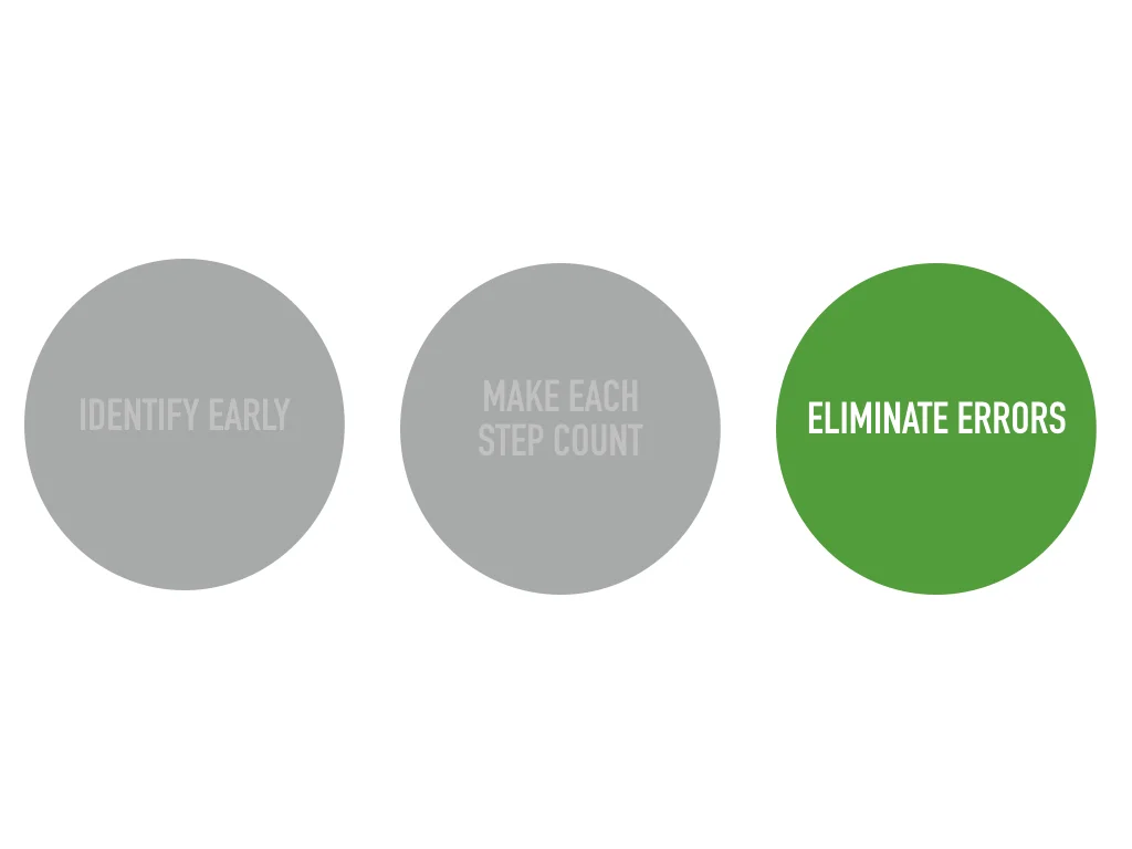
The design strategy I crafted fell into three thematic areas.
Identity migrators early — use profile and other behaviors to personalize the experience for our migrators.
Make each step count — 22 steps is ridiculous, many are redundant, and they’re almost insulting to someone who is already a customer (Hi there! What’s your name?).
Eliminate errors — teach people during the process how to prepare their data and what to do if there’s an error.
OUR MVP: Eliminate Errors
Early on, the team discovered that error resolution was a huge call center driver. This was a result of a two-fold process: (1) the system didn’t surface any errors until the very end of the upload process and (2), the original team hadn’t integrated any troubleshooting prompts along the way. Any time a user’s data hadn’t uploaded properly, they were urged to call the Help Center.
With the goal of helping users understand their own errors, we created a new dashboard view. This eliminated the disappearing instructions and “scary modal” during first-time set-up.
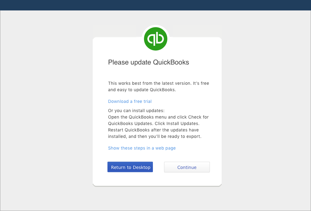
We created a set of clear and actionable error messages. If an error occurred during the migration process, a message would pop up to tell the user how to resolve the issue, as opposed to instructing them to call the Help Center.
FINAL Assets: Dashboard card + Error Message Examples


Early Success:
Numbers tell a great story. Within just six months of launching these changes we
increased our NPS score for migrators by +8 and drove down calls to care on importing by over 10%,
saving the company hundreds of thousands of dollars.

THE VISION: Seamless Migration
The team also pitched a solution for a “seamless migration” that would allow data migrators to import to QuickBooks Online without having to go back to our desktop application product.
In this provocation we identified desktop users from the moment they signed in, bypassing redundant first-time set-up steps. After they migrated their data, we would present a custom learning plan on the activities they had been doing in our desktop application — the cherry on the top of a successful and painless data migration to the online platform.